Tuesday, 22 February 2011

Something Borrowed..

Had an attempt at Paul's technique on tree's, After working on levels and re-designing the planted area. Still trying to bring some 'sparkle' back into the design that has definatly got lost somewere along the way.


Tree's


Fagus spp
Betula?

Hedge/planting from above


Have a look at Pauls Blog, he has put an instructional video, worth a look.
The trees literally took 2 minutes

How?

Water colour and natural sponges.


Conceptual Drawing

Had a go, tried to keep it as simple as possible. A fave medium of charcoal, why? Because its messy and expressive.


Monday, 21 February 2011

Out with old.....

Well really trying to do this quick sketch thing. Takes me awhile to work out perspective in my head, then i draw/scratch, so good, so far. Rendering is were i come unstuck.
So many different ways, now i am running out of my beloved pro markers, forced into looking at more photoshop, block colours and then fading the opacity. It takes me as long either way at the moment but i guess with practice etc.


So here is one i did earlier, can you guess what it is yet?


My iron men battling the current in the middle inspired by Antony Gormley's 
'Another place'. Works well with my 'people centric themed park'.


Wednesday, 16 February 2011

Thought for the day

Listening to the news on the radio this morning, an American academic said that the difference between the US higher education system and many other countries , is that they are taught to challenge the tutor to get good grades, obviously be able to justify that challenge. The point being innovation is celebrated over conformity. Thus the great American way. Is the US in decline? possibly, but as long as innovation is the driver there is always a chance of resurgence. I think this attitude comes from their early history of telling the 'old countries' to bugger off.

The French seem to be taught this is what a designer is, and this is what you do to get there. Whereas we are taught to ask our selves what design is, helped along the way with tools of context, pattern and ratio. So not quite as extreme as the Yanks but less conforming than the French. Though as usual just an opinion through observation.

A scene from Frank Capra's Mr Smith goes to Washington
an ordinary man challenges the old ways, fantastic film slightly idealistic (very Capra) but a good moral of the little man challenging 'the man', the American dream

Monday, 14 February 2011

Its about People...........Stupid

I have been going on (ie boring the pants off every one) about this study along with a book titled 'A Visual Approach To Park Design' by Albert J Rutledge. For the web, Chicago city started an organisation called 'Project for Public spaces' which was inspired by Fred Kent one of Whyte's assistants on the project below.  A massive resource of idea's that i wished i looked into further before doing the document ( i skimmed the edges as lack of TIME like all of us). If i have a passion its making places that effect peoples lifes for the better on a daily basis. Which i realise Parks are one of them. Can you imagine Calverley becoming 'A Place' again? Sod the fancy stuff, get the basics right.....See below.

About PPS « Project for Public Spaces - Placemaking for Communities

So here is the video in question. Made in 1979 (when most of you less than a twinkling in somebody's eye) but still relevant, like good music if the quality is there then its timeless. Thus this research video. An hour long, but totally fascinating. Applies to both parks, the low traffic flow of TW thus need to attract, and the high traffic of Jubilee, need to retain.

I would be interested on your thoughts.

For me, it was the answer to the big question, Why should anybody visit my park, or to put it another way, how do I make my park 'A Place' rather than a field?
https://archive.org/details/SmallUrbanSpaces

On the third viewing (...sad I know) the point of ratio of human space. Too wide and the distance will not be to scale, and narrowness in not necessarily a deterrent. To finish, a quote from the great man himself,

“I end then in praise of small spaces. The multiplier effect is tremendous. It is not just the number of people using them, but the larger number who pass by and enjoy them vicariously, or even the larger number who feel better about the city center for knowledge of them. For a city, such places are priceless, whatever the cost. They are built of a set of basics and they are right in front of our noses. If we will look.” 'William H.(Holly) Whyte (1917-1999)'


The Social Life of Small Urban Spaces, Washington, D.C.: The Conservation Foundation, 1980.

Sunday, 13 February 2011

Le Crunch

Lille 2011


Sunday,


Arrived late so no change there, NetworkSouth East connections/cancellations blah blah.

Hotel room just south of Paris, a couple next door banging for France and finally the Kettle was broken.(though repaired as many know life without Chai for me is impossible)

so a good start.

Monday,


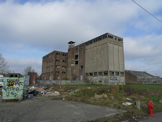
Introduced to the site by the town planners walked around in our team, impression, windy, cold, exposed, industrial, dusty, brewery odours.


Big site 55 hectares.

Started to scratch out a proposal for Tuesday presentation.


Tuesday,


Our theme was escape from the urban, but we really got bogged down in the intellectual process. All very lastminute.com , but fun.

Wednesday/Thursday,


We all worked hard to resolve and combine the two drawings from the two groups. Yes we argued,but in a very good natured way. Win some, lose some.

The God of Context and the saints of the straight line seemed to be our main stumbling block. The main idea in the end was radical so hats off to every one for going along with Simons idea. Pondering further a very good one.

Personally i felt we conformed on other areas such as housing, but its a case of looking past the rendering/model and thinking about the over all long term vision of 100 years. which was a good proposal, ie water recycling from an old dock, and as technology improves thus efficiency increases.


Friday,


Pin up. Worked late and up early to get it all done. We didn't but 90% on the wall missed annotation of master plan.

Master plan hand rendered pencil and pro marker
By Batiste, Soziem and Elise

Paula and Amile worked on the document and putting drawings together. 5 star hard workers!! As usual Sue pumped out some excellent perspectives , love the happy chicken. Susan for her work on planting and placement


Edith and I, the cross sections, i drew and partially rendered she finished rendering and sky, which i love, swoosh. Jamie said it was very good before realising that it was mostly my work, hilarious seeing him backtrack!!!
Found out today(14th Feb) Paula did a bit of PS to lighten the sky and make them brighter...Nice


Photo's of Lukes awsome model. Edith and i for pics then i done the usual photoshop thing for atmosphere. Annotation in a matter of minutes.

One drawing to come with Simons analysis and proposals, very technical,but full of well thought out process. Sue and I also bodged out a time line of 15 years for initial completion. Edith some conceptual, drawings really deep, and more research work from Susan.


Simon And Edith spoke ,very well with Luke and myself jumping in at the end to clarify a couple of points, managed to insult the main man, but hey ho, he won't forget us!

Over all great team work, no slackers every one gave it their all.


Hurrah for the Water People!

Sunday, 6 February 2011

Back to the Coalface

Well had to get back to work and actually earn some filthy money.

Bit of a shock physically, slept like a dead man.

Sketch blow up


Good exercise in thinking about what you have to resolve. My main points to resolve before thinking about anything were spot levels, gradients and differentials as in water height to island height for example.

A lot going on in the chosen area. I can visualise in my head what is going on, which is no help to the viewer so more perspective sketches needed, even the two minute cross section type.

Then i can start to nail down materials and planting styles along with irrigation, lighting, etc.

Reading an interesting book called, 'The Dynamic Landscape'. the outline of the book is about bio diverse planting in parks as the education of the public to understand and appreciate the beauty of naturalistic planting rather than the municipal planting of the 19th century that is still the core of most local authorities , 'we have always done it this way' philosophy.

If the park can demonstrate the example of the naturalistic style with the slightly more formal prairie style then this can help the local authority to use this style as the public will have seen this in the park. Complaints can be referred to the park as an example. A case of re education. Use this style for roadside verges and cut down on the present high maintenance amenity grass that is the norm
A picture from http://www.pictorialmeadows.co.uk/local_authorities

A company providing flowering grasses specifically for local authorities...Nice

Thursday, 3 February 2011

No Oscar nominations for this one

Its is easier with a vid to explain anything on computers, but then 'Peter and Jane 5' is more my level of reading.


Just a point of getting it accurate.

A final point that i missed is the printer even if you have the exact A1 size) always seem to scale down to app 97% there is a box on 'Properties' to put change to 'Actual Size'


I would say enjoy, but when has an instructional video been fun, (unless its about making CAKES! obviously)

Very tired when doing this so a bit of brain freeze, croaky voice and general malaise.


photoshop blowing up an area to scale from Grant Beerling on Vimeo.

Wednesday, 2 February 2011

Lille: A taster for what is to come.

A short vid from lille last year. Just a load of pictures of Garden Designers err being mature.


We all looked so young at the start of the week


Lille Le English from Grant Beerling on Vimeo.