A quick note
I will not be adding to this blog for a while as it will clog it up for those present 3 rd years BA's (good luck to all) who maybe having a look around to see were we got up to in the storm that is the last 5 months of the Degree.
If any of you are the slightest bit interested here is a link to my final work that was pinned up (spelling mistakes and all).
http://parklifetw.blogspot.co.uk
Also continuing (must be raving mad) to study on the MA see 'Felix in a Hat' on the side. Sequential's are slowly improving, determined not to lose that touch that so many before me seem to lose from graduation to finishing the MA. Time will tell.
Any questions etc, feel free to ask, just put a comment on this post. And remember 'it ain't over till the ...... guy sings' (bless him, you won't find a better teacher).
Wednesday, 19 October 2011
Sunday, 28 August 2011

Saturday, 16 July 2011
Trees in photoshop
Photoshop CS5 Tutorial.

Ok it was late and thus a bit monotone, and a few errors for you to spot!
The idea is to show you how to create a simple tree from above with shadow. Its a starter for you guys to build upon so the detail is basic for that reason. A foundation if you like.
It took a long time to work it all out so it has some value to me (at least). So i will share it with Greenwich Students LA and Garden Design, to give you guys something to work with. Really appreciate if you don't publish this video, download it by all means as it won't be up forever.
Come back for updates.
Original Vid below.(Update May 2014)
Photoshop CS5 Graphic Trees from Grant Beerling on Vimeo.
Boys Stuff
If it has an Engine


Thats it really, love looking at any old vehicle, everything has been designed by somebody and thus its quite fun trying to work out their inspiration.
Robby the Robot
If robby drove or built a tractor (and as we all know Robby could build any thing, especially good at Whisky as the story goes, 'Forbidden Planet') i suspect it would look like this.


Kent Show 2011
Hadlow Show Garden
I went along to see the Show Garden that my good friend Whitney designed for Hadlow College.
Outstanding design and followed the brief to perfection. A 'Top Gold' (read best in show) was awarded, and rightly so....
So why was it so good?
Well these are just my humble observations
1) Balance, the ratio between soft/hard/water and the building was perfect
2) No Full stops, meaning that the viewer tended to look at the whole picture rather than just hot spots of design. Thus leading them in to explore further and notice the detail.
3) Journeys, plenty of them each leading to a destination, very hard to do in a small space.
4) Space, or the use of in the sense that the seating tended to be in the furthest corner thus back to the wall and more impression of space.
5) Tones, of the planting flowed interspersed with neutral whites to lift the strong orange/burnt yellows out.
6) Humour and idea's, well we are British and we love a quirky idea.

A few photo's
As usual got a bit involved trying to do the art picture and forgot to take any overall pictures, hopefully Whit will put some up on her blog about the process of the site


Well done Whitney!
I went along to see the Show Garden that my good friend Whitney designed for Hadlow College.
Outstanding design and followed the brief to perfection. A 'Top Gold' (read best in show) was awarded, and rightly so....
So why was it so good?
Well these are just my humble observations
1) Balance, the ratio between soft/hard/water and the building was perfect
2) No Full stops, meaning that the viewer tended to look at the whole picture rather than just hot spots of design. Thus leading them in to explore further and notice the detail.
3) Journeys, plenty of them each leading to a destination, very hard to do in a small space.
4) Space, or the use of in the sense that the seating tended to be in the furthest corner thus back to the wall and more impression of space.
5) Tones, of the planting flowed interspersed with neutral whites to lift the strong orange/burnt yellows out.
6) Humour and idea's, well we are British and we love a quirky idea.

Design and Whits blog
http://reinventrecreaterenew.blogspot.com/2011_05_01_archive.html
A few photo's
As usual got a bit involved trying to do the art picture and forgot to take any overall pictures, hopefully Whit will put some up on her blog about the process of the site


Wednesday, 13 July 2011
Work.....
A small update on a Garden (alas no funds to do the lot)
Always difficult matching your own work with other, in this case a builders 'attempt' and some DIY, so tried to match and improve, but with one eye on the future ie more updates so a bit of a balancing act.
Materials and issues
Every space throws up issues, in this case small, all grass removed, gradient falling towards the house, sleepers everywhere.
The main solution was to provide a new soak away (new crate system wrapped in geotextile felt). Volume .5m cubed (100m2 =1m cubed for well drained soils) for 25m2 area. Slit gully for ascetics, with an adapted 'p' trap gully to trap any fines and access for cleaning. All falls 1-80/100. Normal type one compacted/6 to 1 sharp sand mix for slabs, pointed with buff resin system (which if you pay for the proper German stuff is brilliant and quick, sorry Jamie i disagree with you on this one, now i'll go and dive for cover).
Planting
Worked on yellow and ochre as colours to reflect the colours of the slabs plus to give a warm feel to the whole area. Worked with perennials for the best display albeit for the summer only, a case of a good display for the height of the outdoor season or compromise with spots of colour through out the year... no brainer as far as i am concerned in this situation.
Contrasting shapes with and narrow colour range to keep the effect.


Tuesday, 12 July 2011
Requests, means updates
Blown up images
They seemed very popular with a couple of requests for prints (though i will be keeping the day job).
Worked on a couple thus far, better placement of main characters, a bit of, err covering up, lifting via colour.


They seemed very popular with a couple of requests for prints (though i will be keeping the day job).
Worked on a couple thus far, better placement of main characters, a bit of, err covering up, lifting via colour.


Conclusion
Degree
Two shows, lots of friends and family came along to support. I have had so many meals off the back of this (still a few to go) what a great crowd of generous people i know.
An old cycling/running/swimming buddie and general good all round egg, bought me a graduation present which may be of interest to mac users with old lap tops.
Macupgrades.co.uk (google it)
500mb hard drive nothing spectacular in that, but within it a 4gb solid state drive. The idea being the S/S drive is fast and does all the regular work and leaving the Hard Drive (7200rpm) to take up the rest. really works like a dream, rocket ship. No need to upgrade the lap top for a couple more years. (purchased 2006).
So apart from all the good will and presents any other conclusions?
Confidence has improved, but most of all just the fact that social mobility is possible if given the chance.
Hard work is rewarded, left-field thinking in the right environment is a bonus, photoshop is the modern paint pallet and finally the spectrum of design is broad, so even not every one gets it, not a problem as thats the beauty of the diversity of humanity.
So what hasn't changed?
My modernist view that form and function will always be closly related. The idea to benefit people (or the end user if you like), still its not about designer more what you can give to enrich peoples lives within the opens spaces that we are resposible for, if its not adopted by the public then its a failiure. Most of the designs that fail, fail to communicate what thier purpose is and thus get ignored or even despised. If there is any kind of pretentiousness behind the design, (ie don't preach, lead by example) it will be picked up especially by the British public.
Some images that were blown up for the MA show
They seem to go down well, doing my 'painterly' thing that Jekyll was famous for, though maybe not up to her standard.


Wednesday, 8 June 2011
Web Site Trick
Trick
I almost forgot (and have updated). when building a site with your fave font (futura and gill sans in my case) and are not sure whether your average site user will have it (if they don't then a default font will take its place, normally ruining your design) then you have to think laterally.
Remember some old pc's and new versions for example don't have futura or gill sans which is unbelievable or should i take a hint.
Back to the task, duplicate your written work turn it to the back ground colour you have chosen. Put it behind your original work, this will be picked up as written work by internet search spiders.The written work above turn into an image.
On iweb this is simple, put a shadow on the work the SAME colour as the background, (thus it will not show up) this will automatically turn it into an image.
If you know HTML have a look and you will see it in the code.
It works, so now updated so everyone can see the Herculanum font i have used as my logo for Park life.
To check (especially if you are a mac user) find an old pc and look via the web.
http://web.me.com/hixondesign/Parklife


Three favourite snap shots from 1:50 cross sections that are on the back of my business cards, not everyday you get a President visiting your park, i can but dream.
Calverley Grounds Tunbridge Wells
Site
Built a web site with apple iweb so no flash, but has come out alright.
Enjoy, any constructive criticism welcome.
http://web.me.com/hixondesign/Parklife

Built a web site with apple iweb so no flash, but has come out alright.
Enjoy, any constructive criticism welcome.
http://web.me.com/hixondesign/Parklife

Done, Dusted and back to reality....Bump
Time......


Been a while due to doing stupid hours to get it all done, got to the point were sleeping seemed like a guilty pleasure!
Everyone really pulled something special out of the bag in the last two weeks well done to all my class mates.
As usual looking around at everybody else's work see big gaps in mine, but came to the conclusion that we will always be better off following our own cue.
Regrets, still think my sequential's are a bit heavy, whereas my 1;50 seemed to hit the spot, with movement and a light touch.
Would've liked to have done a seasonal page as i played around with colours earlier on, no time. Would've liked the model to be better, seeing the rest of the class picked up some good idea's, and well done some really nice models.

I think i managed to get the point across with this one, room for improvement on the trees though.

Obama visits Park life for inspiration and too meet an old Mexican friend

Distance and our friendly monks take a stroll.

A particular fave, really thought about the issues as i designed this in particular hidden fixings, but with accessibility for maintenance.

This one seemed popular in the sense 'ooh i would like to go there' so managed to sell the festival idea with the ravine.
Just need £20million to build it..... offers welcome
ZZZZZZZzzzzzzz
Thursday, 12 May 2011
Home Straight of the Marathon.....
But who put all those Hurdles in the way?
Well thats how it feels, but we all occupy the same boat, though Adele seems to be swimming at the mo.
Well working like the proverbial on the planting scheme lost count how may days, keep changing my mind, then visualise and think....... too many ,too few, too busy not exciting enough..then i run out of steam and have to go to bed, only to wake up stupid early and start working and go through the same thing again. So put it to one side for a mo and finished a couple.
Levels and Spot Heights

Had to do spot heights and levels on their own sheet as they are important and if they can't be read combined then there is no point. So many redraws, did the steps three times kept forgetting something. eventually worked out with 400mm treads (jamie will be pleased) and a decent mid point landing. Spent a while making sure gradients worked with 1;200, and they do with some juggling (thus the step drama's).Spent some time on the seating area's thinking about the interaction of people within the spaces.Changed my retaining walls along with stair details.
Also spent some time looking successful parks and the atmosphere that one is left with and whether the design is successful or not. Top of the list is the High Line in New York, ticks all the community boxes, visitor, seating, planting, people watching all within an atmosphere of relative serenity (well as much as one can expect in the middle of a busy city). A must visit next time.
Hard works Key plan

Made sure the rendering stands out and is clear in black and white. So many construction drawings off the back of this. Went into too much detail on the key i think, plenty of time for that on the details. Thanks Sue for the Gradient calculator, saved so much time and grief, got the decimal place in the wrong place a few times was that 30mm or 30m?
Silly stuff
Found this while reading a report on the high Line. let it read your blog and it picks out the most used words in size, surprised to see the word shit and bollocks missing, i am obviously losing my site manners with all this white collar education stuff or that could be a load bollocks!

Or 10 words.

Bed ZZZZzzzzzz
Tuesday, 3 May 2011
Quick Brew....yuk
Quick Chai...MMMMmmmm
Just an update on the mood board.
Line drawn 1;50 resolved a few issues and found a few.

Just an update on the mood board.
Line drawn 1;50 resolved a few issues and found a few.
Tried some other alternatives, but couldn't better the images for the mo. P/S more vibrance some tricks with spray and enlarged the lads. Feel something should be done with prairie pic but don't know what.
Still find president pics, do a bit then walk away, as time just disappears otherwise.
Broke iphone today....brilliant!!!!
Monday, 2 May 2011
Don't push me, cos i'm close to the edge
I'm trying not too lose my head.
As 'Flash' put it (the grand master of the furious five). The message still holds its own and was the first 'real' bit of hip hop to hit my young ears back in 81 and was an instant convert to all things New York.
Unfortunately i went over the edge today when i realised the document that needs proof reading and up dating is on the external hard drive that has crashed.
Then as luck would have it, found the file on my Main Mac only for it to be corrupted and refuse to open even though it was showing 50+gb. Threw a hissy, broke my glasses (all £10 from Tesco). Fortunately a friend happened to call and calmed me down.
So looked around blah blah, threw a prayer up to the Great Garden Designer in the sky and presto it opened, only 10 unlinked photo's that are easy to retrieve.... Calm restored.
Progress
Is slow, no matter how many targets i set it takes an age. So this is were i am at. Finished and annotated all the Sequences, Lighting spec done, Updated lighting plan and festival plan, spent an age on the model image plan, but that paled into insignificance compared to the 'Mood board' how difficult is it to find 5 images...bloody difficult thats how much! And then arranging them in an eye catching way, playing the 'less is more' trick, so difficult and time consuming.
Stumbled on a couple of things 'playing' with the sequence images, how to get some life into them, out of the box, simple as that, done one, not going to do the others. No time. I will probably do it on the 1;50 sequences. Using cut out people,but manipulating them so that they 'sink' into the image.

Turned this into a panorama and pulled Hari forward to give the image more width.Plus moved some of the trees higher to the right. Made the path wider as it was going to narrow to quick. Overall looks more balanced.

As Mr Chilli is a fellow republican i was going to send an image with some Royal joke, anyway these guests heavily p/s to sink into the image plus heavy shadow walking out of the frame, suddenly looked a lot better, lesson learnt , knew it from previous work but got so close to the trees that i could not see the wood.

Took some more model images, had a go at a quick render, inspired by Sue's pain bucket. Did this with a 'wet brush' and some quick filters to sink (Multiply) etc.
Does not look to bad, gets the point across. I am sure with practice one could do some thing half decent. Did not use on the model sheet, time.......

Did a bit of a 'Paula' on this one, as in lining everything up, and really thinking hard about composition. Yep it should be 5 images, but it just would not work. So head on the block, 1 and 3 images are uneven numbers and thus clusters.
I am probably 3mm out somewhere Paula!

Spent an awful long time trying to find the 'right' kind of lights. Some don't exist yet. It seems to me that most of the lights are made in China and 'Badged' (when several retailers put a name to a product that has been made centrally by one anonymous manufacturer).
So managed to find some recent prize winners from the USA for innovation etc. So the latest Phillips High out put LED's (17.5w for small and 30w for flood). Still think there is a lot of room for some bespoke designed lights. The rope LED's are still in their infancy so expect in the near future a lot more LED rope, lamps (bulbs are what you plant in the ground) and lights to come out.

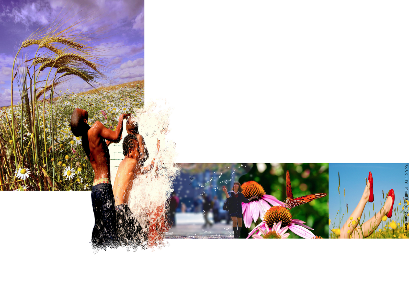
Mood board is a good name as i was in such a foul one while doing this! Cut out some of the images so they merged into the one below. Have not changed the colours or any other p/s stuff. Thank god for 'Flicker' and screen shot on the mac. 5 images with some hierarchy hopefully got something across. Tended to look for pictures until one would' hit me'. This takes some time unfortunately.
Just got Precedents to do later today, (done just need updating to get some more zing and relevance) then 1;50.
Thats it folks.
Friday, 29 April 2011
DJ Shadow 'Entroducing' the darker side.
Shadows that follow.
Seem to be getting slower as fatigue strikes. So eventually the sequential sketches (annotate tomorrow on a fresh head).
But first, had a look around at what the rest of you lot are doing, bloody hell there is some good stuff, particular praise goes to Mr Chilli for his bounding leap forward ( i assume the name comes for 'hot air') really looking solid. Just reminds me of what is expected.
Aija s model, blinding, Alicks drawings (and studio, so tidy i wouldn't dare put a photo up, for the simple reason the camera is buried somewhere and all you would see is a sea of tracing paper ) stunning, Sue's 'light touch' of lovely sketches, great shadows. Looking forward to seeing the rest.
8 Sketches.
In no particular order. Updated the previous ones with more shadow (lifts and creates atmosphere, cheers J), backed off the bright green to a more subtle muddy green/yellow. Though i would really like to do a three colour scheme (as Helen Armstrong appreciates and i get it, may do something with the model photographs on the ' abstract/atmo if i can).
Neil will so tell me off for saying this, but still not sure whether i really like this style, a case of looking over my shoulder a bit too much i suspect. On the plus side learnt an awful lot about creating depth and tree's.
Maybe its a case of Tracy Emmin, do fine art, nail it, then go abstract as she understands the techniques of 'realism ' but wanted to get beyond that, so use an unmade bed to tell the story, maybe my messy workspace has some use after all!

The large Oak and steel Pergola, +Wisteria. A mobile (park stored) refreshment to provide the eat, sit, meet, watch that people so love.

Looking over the bottom interaction area (ooh-err-missis, that sounds a bit Frankie Howard). Human scale of height to width, with prairie views that people find so attractive. Shadows are a bit messy.

Looking up waterfall. Added shadow like this one slightly abstract, three colours, though not thirds!

Looking down from the upper small cafe/art space under the waterfall. This is the view that you can see the ashdown forest in the distant view. Glimpses of a view provide some curiosity.

Looking down along the rear ravine evening sun. Long shadows.

Hari. K. Rishna in his orange top surveys the view from the Island.Used the same blue to look as if the water colour reflects the sky, not quite worked. Feels a bit narrow for some reason. To late now.

Looking up from a ravine to the Picturesque style high walk way. Shadow the the first part of the ravnie with light from the intersection ravine splashing light over the rock. This one and the one below i particularly like. First and last.

Looking down toward the Pergola. With the slightly wild looking perennial borders sliding down the hill side for all to see. tree's a bit contrived/solid. Changed the colours for a more yellow/green corn scene. Thank god for 'replace colour' in PS
Annotation tomorrow, i have decided to put them all on individual A3 size and annotate from there. I can easily put on a A1 if needed.
Hopefully will have a good day and find some nice/better images for mood and precedent, plus lighting plan. Been listening to too much Trip Hop so the mood is on the wrong side those glum people from Bristol, i must be some kind of Dummy.
Night all. ZZZZZzzzzzz
Tuesday, 26 April 2011
Futures bright, futures coming to quick!!
Time
Still chained to the mac, thank God for some good tunes too keep the spirits up, mainly been feeding on Brazilian, Cuban, with some old school (can't remember how to spell it wrong to be all hip, bit late for that now).
Well three more sequence sketches, learning new stuff and tricks all the time. Used a lot of images that i have already done to save time and manipulated to suit.
Finished all of them with 'Dry Brush' filter to blend all the different components together.
Particularly pleased with the water fall.
Images look a bit literal, plus bright colours, its the point of communication or do trendy colours, trouble is what i like and think looks 'cool' nobody else understands, a case of being on the wrong planet/universe depending on your view of Quantum mechanics.

Dry brush to blend and calm down some of the colours.

A mixture of photo plants and plants from above, plus some. Still a bit janet and john on the colours, but can be adapted.

Dry brush really worked on this one. Used some real people, plus some work to get them to 'sink' into the image.

Worked quite hard on this one making sure the eye line worked looking up the waterfall. Waterfalls are 'white' water so no blue/green. Tried to get movement and spray.
One more tomorrow, annotate then precedent images.
Not too much moaning Neil, though kettle and black come to mind!
LOL as usual Mr Chilli, cheers.
Subscribe to:
Comments (Atom)