Wednesday, 27 October 2010

Rendering..good or bad?

Its not modern (1945) and its not clever, but i really like the simplicity of it. Back to my Janet and John view of T/Wells. The simplicity means that the idea is immediate rather than trying to look past fancy rendering covering up an average design (i am very much speaking to my self here). i am not saying i like the utilitarian design (form follows function), but there is a certain honesty about it. Plus the instructive Gill Sans font, very 'KEEP OFF THE GRASS'.

Or am i talking blather?


Harry Wingfield illustrated books of the period, very idealistic. 


Friday, 22 October 2010

A4 Quick Sketch Designs.. a bit mad.

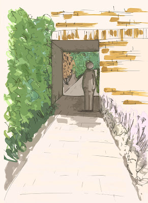
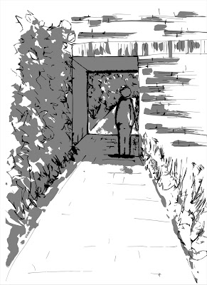
A couple of sketch designs, a quick style with pro markers, and some photoshop filters to make it look a bit more abstract.

As for doing a proper m/plan still not found a style, but i don't really like the realistic look at it dictates whereas an abstract style adds atmosphere (depending on the style of abstraction or should it be impression, well you get my point).


Thursday, 21 October 2010

Line Path

 Had a go and understood the more i did it. A hilly bit of woodland. The feel rather depends on the time of year. Summer hard, compacted and dusty. Winter wet, slippery or rock hard. Seasons colours, sounds and smells. All very poetic, but relevant.


Had a thought about a windy day. A lot to remember for future surveys.

Scanned colour sheet...Results


Promarker pens, all the warm greys. The greens and other colours I tend to use.
Scanned then printed.
As expected the vibrance has gone and it seems blue added making the warm greys colder.
Will have a go with other media.

Sunday, 17 October 2010

Masking

Hi all,
If anyone can simply explain i would be grateful. Can't seem to get my head round it. Get it for 5 mins then it goes. Just need a simple technique, obviously.

 Cheers.

Fat Controller

Images taken from my own photo's plus some web images. A bit of wine seems to make things flow a bit easier.

Images cut out and pasted in PS, very quick. Quite a bit of time on the Transform tool. Warp, Perspective and Skew. Some blur on the edges and reduction on opacity on steam.

 Flattened, Cutout, and poster and general playing. Played around with the roof and made it worse. If it ain't broke and all that.

More playtime. Added line and mucked about with shadows and brightness. The idea to get the image to join together. Ok a bit abstract but the brain fills in the gaps or is that just me???


Took away the edges to reveal the construction, more movement in it. Red to draw the eye, etc


Conclusion, a bit of fun but need to watch the clock a bit. 3 hours for that lot.

First set Pro marker plus photoshop

I started with the promarker route plus photoshop as i wanted to see if i could do them quick. 20 mins for the basic, then another hour for the rest (more about experimenting). If i follow that style it could be quick it depends on whether its too scrappy.

Promarker, and .3 and .5 felt pens.
Various, cutout plus poster plus gold style with some colour burn (grr tiger).
Black and white option, pencil, and 2 layers of black/grey.


Distance is my best friend!

So there we have it, hall of shame!!


Thursday, 14 October 2010

Calverley Park

I had some work in TW recently and wandered down to the said park. Took a load of pictures with my new camera(old camera's broken, a case of built in obsolescence from Sony), so it was not such a bind with a new toy that is way beyond my abilities.

To the point, Those who are going to TW on Monday and don't know the place some tasters

TW, Materiality
 http://gallery.me.com/hixondesign#100646&bgcolor=black&view=grid

Calverley Park
 http://gallery.me.com/hixondesign#100639&bgcolor=black&view=grid


Panorama's (the best pics to get an idea of the park)
 http://gallery.me.com/hixondesign#100656&bgcolor=black&view=grid


Feel free to nick, er, download any pics that catch eye. All at full resolution so be patient on the download.


Cheers

Tuesday, 12 October 2010

Composition

Well I thought I would put up my thought process on getting to the point were I got to for pin up (after seeing everyone else's work wished initially i had done things different, but then started thinking again, more blather later).


So the difficult bit. First was a vertical grid. All pictures the same size evenly spread. Rejected because there was no hierarchy and even though the second pic was in the middle (the strongest in my opinion) it was lost, plus the name
tag = lost
Futura font/light grey


So Changed the angle, increased the size of yellow pic to dominate, the others as secondary. A bit of clipping. Top one Futura, lower case, grey. Font just sticks out as to formal, the grey look half hearted.


The second font Amsterdam Graffiti, black. The font was to give the idea of a 'Sketch design' i.e. less formal than Futura. The name is to close to the middle rather than bottom right, so could lead to the viewer not looking at the bottom of picture. Ie last thing you see is what you remember, so it should be the name?? or not, not sure.


No4. Decided the Blue Ice scene was to much like African Dust. So decided to do a top view (my only chance to get in the Tate Modern). Due to the different shape of the image it threw out the above pattern, so tried this, but decided the yellow pic did not dominate enough. Name in right place but does not sit comfortably.


Then a lot of playing about with the Transform button and got my yellow dominance back. The name aaagh. The two 'g's.


Finally, changed the font to Lucinda sans typewriter, lower case, Ages trying to get it to line up (thanks Paula!!!!!) and i will now blame the pinter/pdf/adobe /the weather/George Bush for that 'alleged' 2mm.


After looking at all the other work on show and listening to Jamie i thought what could i change. Well on reflection because of the style of the images, i.e. quite conservative, cutting the sky's out would lose the atmosphere, i.e. dark night, african storm, enclosure of the Tate. If the images where more abstract then yes.

So why do i see the world this way?  As that was the point of the lesson, how you and I view the world and thus interpret space. Nature or nurture? Personally I think more Nurture that nature. 
I noticed the way i always design is straight lines and arcs all scratchy and quick.
As a big fan of the Construtivist movement, Le Corbusier etc, (modern rather than post modern obviously)reminded me of a picture in one of my constructivist art books. Doh!
So as usual 'Nothing new under the Sun'. Plus my Step Father is a cubist Artist and thus grew up with it.

                   Liubov Popova                   SPACE-FORCE CONSTRUCTION  
                                                                                         1921

There we go, got that out of my head. Just need to work Genius Loci!!!!!!!

Obviously there are a hundred and one ways to get to the final point, this is my rather teeth sucking, looking in the mid distance, OCD kind of way.


Friday, 8 October 2010

Finished Sketch Model thingy.

Is there anybody out there?


Phew, changed my mind about one of the images (thanks Karen) so rushed out another. just the dreaded pin up Monday.


Now a weekend of Roman religion, as Sid James would say with a filthy laugh!
This blog thing is a bit like talking to yourself, yadda yadda.


I may put images up, depends on how much slagging off comes from Jamie, annoyingly he is normally right...Doh!


Cerax Creativity Test

Well i have published this on the 17th July 2011 as i saw that Joey had put his up and i missed it.

The one thing i get a high mark in does not count......Doh! 

Did it two years running and remarkably it came out within one point, i think the change in the bias is due to my change of attitude, to become less of a shrinking violet and more of a bold sun flower.

Still have severe moments of doubt, thats why i buried it back in this part of the year. So bold in design and belief, just not in the chase to be an Alpha male.
So Lille taught me to stick to my Guns more and take defeat on the chin and not personally, and success with modesty. 


A bit messy due to being in the back of my thrown around sketch book, which went everywhere, on site as well as at home. Could not find the originals on my computer due an external hard drive failure.....back up your back ups..when will it end.


Roll on the day when Solid state hard drives are cheap enough to bin the susceptible disc spinning hard drive we have at the moment. So yet another £150 to retrieve, doh.


Those who know me, know that generally i walk around with my head in the clouds, and can completely miss stuff. Can't do plant idents due to my Dyslexic memory, or spell and have a gift in terrible grammar.Everything is in 3d picture form, so i think this lines up with this kind of test. Also left handed, to add to the creative theory.


Joined myself and can't delete!!

Anyone got any idea's. I am not in manage blogs, so can't delete. I am not in settings. So its there but no way do delete. This is NOT an intuitive programme (reminds me of autoCAD).

Waisted a whole evening on this, also apologies to those who have two entries on followers, again can't delete 'Grant' or felixfatfunk. I have a blogger account and Google account (which is a combined utube/web/blogger ac). So obviously google account but this other account just keeps appearing on its own. Whatever ever happened to Ockham's Razor!!!!

Anybody??

Wednesday, 6 October 2010

Images

Well found the 5 min sketch modal thing a bit of Panic. I am defiantly a thinker and five minutes is about the time it takes me to think of making my first cup of tea. I think Day Dreaming could easily be listed as one of my hobbies so the crash, bang, wallop of Jamie s classes come as a bit o f a shock.

Good Day finished Sketch A1 Reps. Like them for 5 minutes then start pulling them apart, so going to leave well alone and get on with Toms work.

Saturday, 2 October 2010

Creativity

Final Year, Finally

Hi All,
Not sure how to go about this blog thing, but if you decide to pop in and see some of my work go from an ugly duckling into duck then jump on board the Fat Funk train of the imagination, and other such blather.

Grant